One of the most difficult parts of print marketing is finding the right layout for your project. While investing in print marketing may not seem like a priority, it's much more effective than you'd think.
One of the best ways to share information is with brochures. Brochures offer a lot of space for both text and images.
The two most popular choices for brochures are tri-folds and z-folds. But how do you know which one is right for you?
Read for everything you need to know about the differences between tri-fold brochures and z-fold brochures.
Tri-Fold Brochures
While tru-fold and z-fold brochures are very similar, they have their own unique characteristics. These layouts are used for different projects depending on what you need.
Tri-folded brochures are the most common of the two. Its design is popular and easy to navigate, making it easy to display information to readers.
These brochures have three panels on the front and three panels on the back, giving you six total. The ends of the page fold inward, displaying one of the panels over the other.
Though the center panel is a bit smaller than the other two, there is still plenty of space for content. While many programs have templates that you can work off from, hiring a graphic designer can make a huge difference. Having a strong design can make the information and meaning of the document that much more memorable.
People prefer these kinds of designs because it allows you to display information in a logical order. Between the easy readability and the creative potential for the brochure, tri-folds make a great choice for your document.
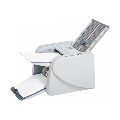
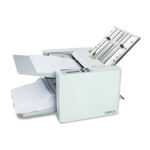
Video of folding tri-fold with MBM 98M Folder
Z-Fold Brochures
While tri-folds may be a popular choice for brochures, they aren't the only choice. The z-fold brochure offers an excellent alternative for your physical marketing campaign.
The "z" in this brochure can be found in how the pages fold. This fold is different from the tri-fold in that the pages fit together like an accordion. Instead of both panels folding inward like the tri-fold, one folds into the back to create the "z" shape.
In addition to its unique shape, it also offers a lot of versatility for the design itself. When unfolded, the design spans the full page. As a result, it allows you to create a flexible, eye-catching design that works on each panel individually as well as all together.
Because the panels are all the same shape and the design fills the page, the z-fold has a lot of potential for a unique design. Z-folds provide space for you to use a combination of graphics and images, as well as text.
While they may not be as popular as the tri-fold, they can be just as effective when used right.
The Difference Between Tri-Fold and Z-Fold
Picking the right layout for your brochure can make a bigger difference than you'd think. While they each have their own advantages, tri-fold and z-fold brochures offer a lot of potential for you to create unique physical marketing documents.
The size and shape of these brochures have a lot of potential for creative designs. Deciding which one is best for you depends on the document's purpose, topic, and audience.
Check out our blog for more tips on how to use print marketing to promote your business.


