Should you use a tri fold or bi fold brochure for your marketing campaign? There are advantages and disadvantages to both. Here we'll show you how to choose the right fold for you.
Brochures can be a fantastic marketing to if you use them correctly.
The most difficult thing about them, though, is choosing the correct format for you. Something as simple as the way the brochure is folded affects how customers view your content.
So how do you know whether a bi-fold brochure is the right presentation or if you should go for a tri-fold one? Well, there is no one set answer. It depends on what you're trying to portray. Let's look at the pros and cons of each and then you can decide for yourself!
Bi-Fold Brochure
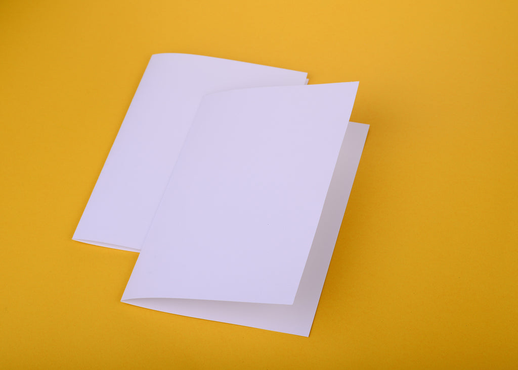
A bi-fold brochure is folded just like a book. For this reason, the presentation is also known as a half fold. It divides your content evenly into two parts.
Pros
Bi-fold brochures are great for capturing attention. They are wider and therefore more easy to spot.
The wider pages also allow for a better photo display. You can either fill up a page or the entire brochure with your photo. If you choose the whole brochure you'll still end up with one crease in the photo, but that's way better than multiple creases.
Cons
While the bigger size is nice for catching attention, it also makes the brochure a little less convenient. Many brochure racks are made for smaller brochures and you might have a hard time displaying it. It all depends on where you want to display it.
Tri-Fold Brochure
Tri-fold brochures have two folds that make 3 equal parts. The presentation style is also known as the letter fold since it is folded just like a letter.
Pros
The great thing about this fold is its convenience and versatility. It folds up small and doesn't take up a lot of space. You can even mail it like a letter. Yet when you open it up there is plenty of space to put information and images.
Because each leaf is narrow, they can be great for presenting information in bite-size chunks. People can easily scan text and quickly get an idea of the information being presented.
Cons
Since there isn't much space on the front, you have to carefully design the cover to catch people's attention. It can also be harder to stand out because the tri-fold is such a popular fold. Everybody's brochures can end up looking similar and yours might get lost in the crowd.
If your content is highly visual, the extra crease can really take away from the look of your images. Plus, making the image small enough to fit in one section may make the image too small. It simply won't have the same impact a larger image would.
Which One For You?
So which one is right for you? Should you choose a tri-fold or bi-fold brochure?
Well, there isn't really one right answer. It depends on the information you want to share and how you want to display it. Hopefully reading through the pros and cons of each brochure fold type will help you decide the best format for your brochure.
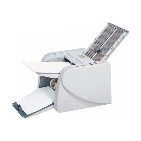
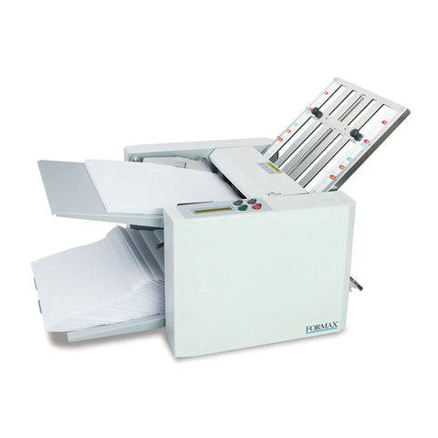
If you have a lot of brochures to fold, check out how a brochure folding machine can save you time and money.
Looking for more paper folding tips? Be sure to check out our blog!


