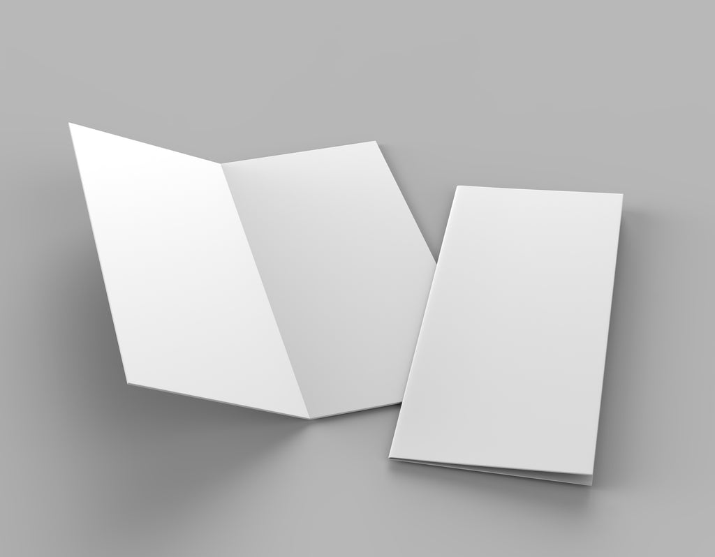
A bi-fold brochure is the most common type of folded leaflet because it's so versatile. From weekly church service programs to seasonal events brochures, the bi-fold holds all vital information in one pocket-sized package.
So what's the best way to set up and design a half-fold brochure? Follow these quick tips to make sure your next brochure is perfectly printed and folded!
What Size Is a Half-Fold?
A bi-fold or half-fold brochure is half the size of a standard letter (8.5 x 11 inches). Each page will measure 8.5 x 5.5 inches when your brochure is folded.
So, when you're designing your brochure layout, think of a normal letter size that's folded in half to give you four pages (front and back cover and a double spread inside).
How Do I Set Up My Design Canvas?
When you set up the page size in your design software remember to leave some room at the edges of your canvas.
This only needs to be small: up to 0.25 inches is just fine. This will give you room for printing without risking cutting off any important information if the paper is loaded slightly off-center.
For a four-page half-fold, you can either set up four half-page size spreads or two standard size spreads, depending on how your design software is set up.
If you're using two standard size spreads, remember that the first page will be your front and back cover, and the second page will be your inner page spread. Your front cover will always need to be on the right-hand side of the spread so that it is on the front when the paper is folded.
If you're creating a brochure with more than four pages, remember that you must create them in multiples of four (eight, twelve, sixteen and so on). This avoids having any blank pages in your brochure.
Top Brochure Design Tips
Now you've got your design software ready to go, follow these easy design tips to make sure your half-fold brochure is eye-catching and easy to read.
Remember the Crease
Avoid running text or images over the center crease on the inner pages. The fold could mean that important words are lost, or dark ink cracks when it's folded.
It's best to keep all of your page designs within a half-fold size design canvas to make sure you're not going to run text over the crease.
Stick to Brand Colors
If you have brand colors then try to stick to them instead of using every color available to you. This will keep your message visually on-brand, helping to push home the point you're making with the text inside.
If you don't have brand colors and you're not sure which ones go together well, check out Adobe Colorwheel. Pick one color you like, and use the drop-down menu to generate complementary color palettes in seconds.
Keep It Simple
It's tempting to include as much information as possible in one small bi-fold brochure. However, keeping to minimal graphics and making sure you have lots of space around your text will make it easy for people to read.
The easier it is to read, the more likely it is that people will take the time to go through the entire booklet.
Use Information Pointers
If you still have lots to say but just can't fit it in on your brochure, make sure to include clear website, telephone, and social media contact information. Signpost people with clear headings to let them know where they can find out more information online or by calling your office.
Don't Fold by Hand
Hand-folding a stack of half-fold brochures isn't just mind-numbing but it also risks the overall quality of your booklet. It's easy to get hand-folded brochures misaligned, which means you could end up with unattractive wonky edges.
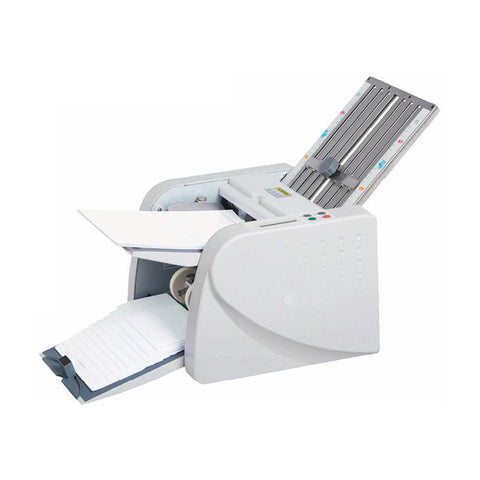
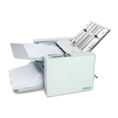
You don't have to! There are lots of cheap manual and automatic paper folders available on the market which will do this task for you. Investing in a paper folder will mean it's much quicker and easier to create effective bi-fold brochures than ever before!


